
OCT. 2023
Surface&Architectureのjournalでは、S&Aの新しいメンバーでトルコ出身のMerve(メルヴェ)によるデザインレポートを全10回にわたり公開していきます。レポートでは、毎回2023年のデザイントレンドをテーマとして設定し、グローバルな視点で考察していきます。
デザインレポートの概要についてはこちら
テーマ 「アルファベットを超えて: タイポグラフィの実験的・表現的進化」
Typography is no longer confined to the strict rules of letterforms and legibility. The experimental evolution of typography is seeing type being transformed, distorted, and reimagined in ways that not only communicate but also captivate. A shift towards an experimental, dynamic approach in typography is reflected by these instances. Designers are bending and breaking the rules of type, transforming letterforms into flexible and adaptable elements. The future of typography seems to lie beyond the alphabet, in a realm where type not only conveys messages but also becomes a medium of expression in itself. This experimental evolution of typography heralds a future where letters will be more than just symbols—they'll be experiences.
タイポグラフィはもはや、字形や読みやすさといった厳格なルールに縛られることはない。タイポグラフィの実験的な進化は、コミュニケーションだけでなく、人々を魅了するような方法で、活字が変形し、歪められ、再構築されるのを目の当たりにしている。これらの例は、タイポグラフィにおける実験的でダイナミックなアプローチへのシフトを反映している。デザイナーたちは活字のルールを曲げたり破ったりして、書体を柔軟で適応可能な要素に変えている。タイポグラフィの未来は、アルファベットを超えて、活字がメッセージを伝えるだけでなく、それ自体が表現の媒体となる領域にあるようだ。このタイポグラフィの実験的な進化は、文字が単なる記号ではなく、体験となる未来を予告している。
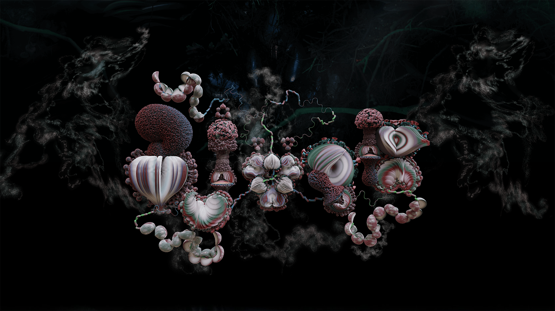
- Fossora - A Typeface Inspired by the Life of Mushrooms for Björk’s Latest Album: This experimental typeface pushes the boundaries of traditional typography, drawing inspiration from the organic and irregular forms found in nature, specifically mushrooms. The resulting typeface serves as a visual translation of Björk’s ethereal and otherworldly music.
- Fossora - ビョークの最新アルバムのために、キノコの一生にインスパイアされた書体: この実験的な書体は伝統的なタイポグラフィの限界を押し広げ、自然界、特にキノコに見られる有機的で不規則な形からインスピレーションを得ている。出来上がった書体は、ビョークの幽玄で別世界のような音楽を視覚的に表現している。
Fossora Typeface – M/M (Paris)
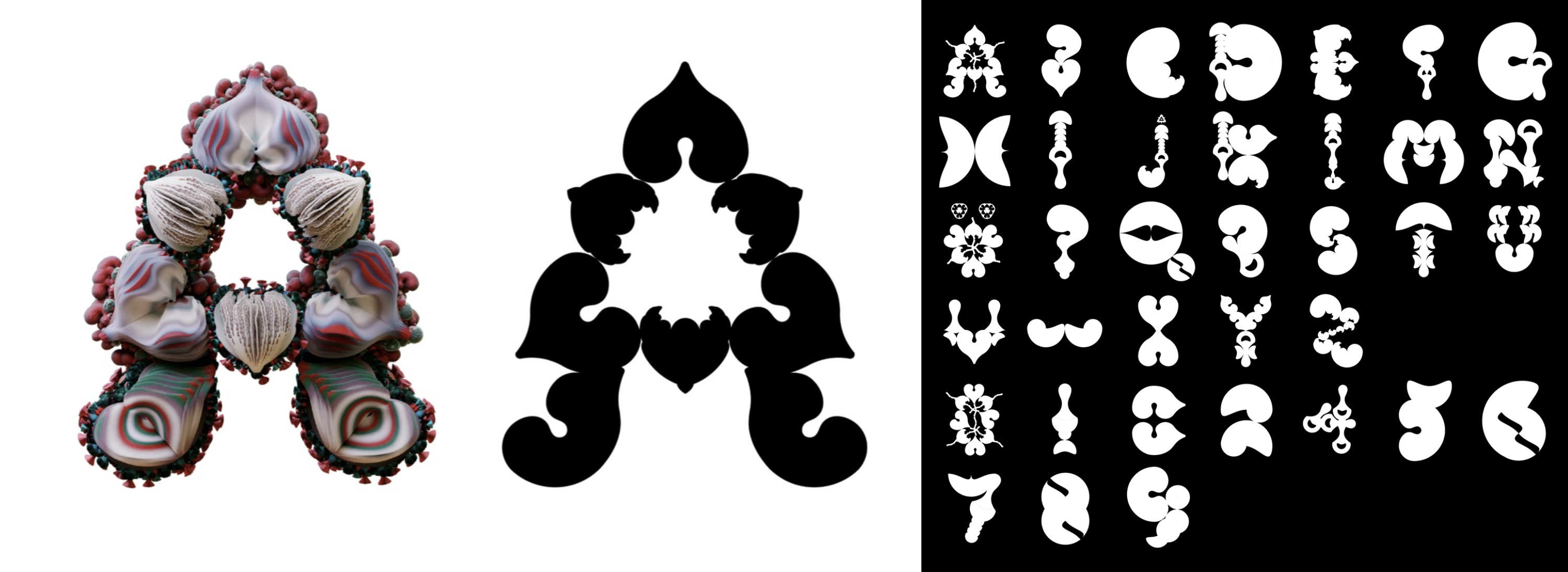
- Phase - An Experimental Typeface Open Source Algorithm by Hanzer: This typeface defies traditional typographic norms with its shape-shifting characteristics. Hanzer’s typeface is not just a static set of letters but an interactive visual experience that morphs and changes.
- フェーズ - ハンザーによる実験的な書体オープンソース・アルゴリズム:この書体は、その形を変える特性によって従来のタイポグラフィの常識を覆す。ハンザーの書体は単なる静的な文字の集合ではなく、変形し変化するインタラクティブな視覚体験である。
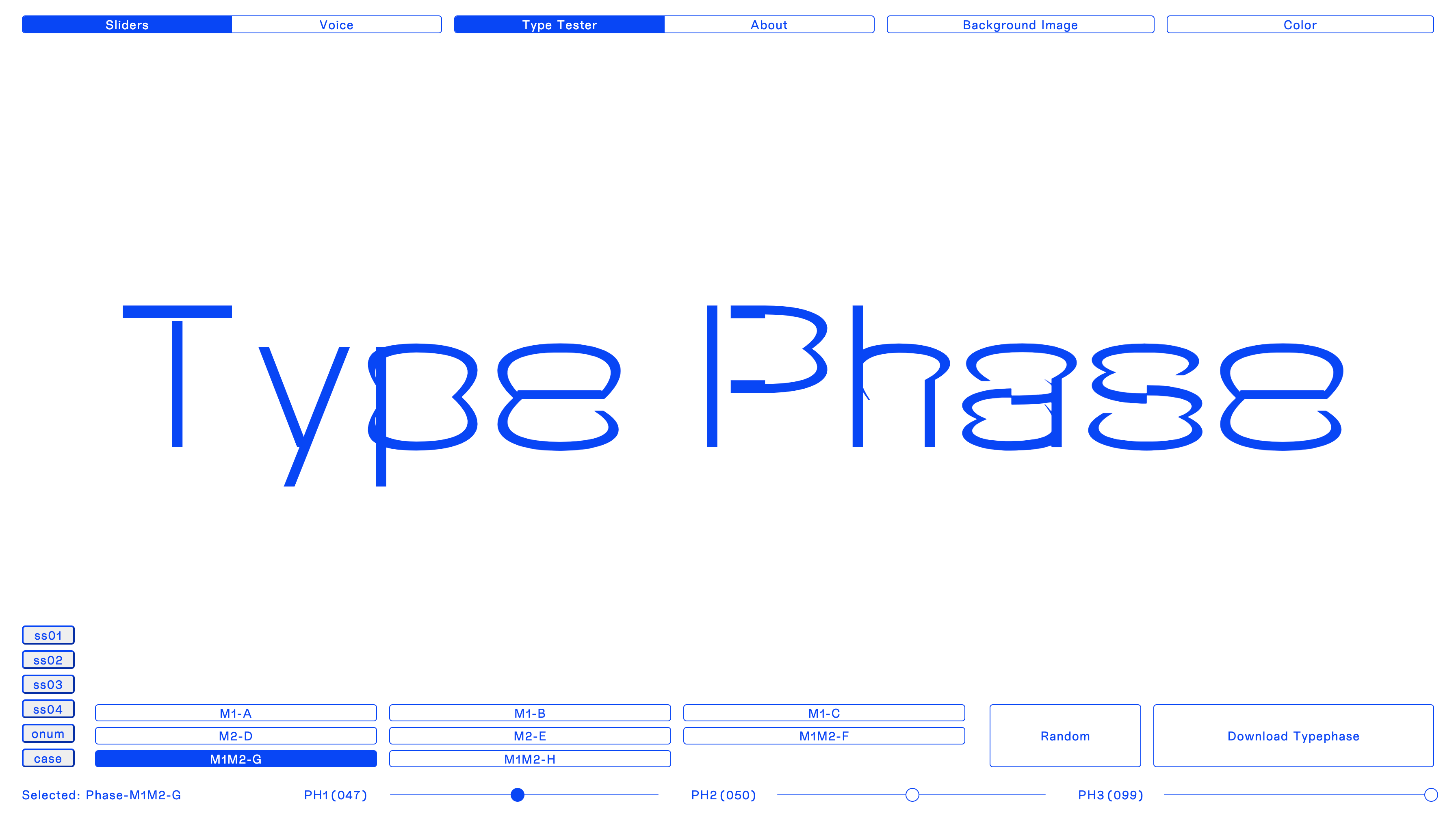
Type Phase – Elias Hanzer
- Expressive Logotypes & Serif Normalcy - The Year Review by Under Consideration: This review showcases the latest trends in typography, highlighting the shift towards expressive and dynamic logotypes that break away from conventional forms. The review also includes those that have chosen to stay with more conventional choices.
- 表現力豊かなロゴタイプとSerif Normalcy - Under Considerationによる年間レビュー: このレビューでは、タイポグラフィの最新トレンドを紹介し、従来の形から脱却した、表現力豊かでダイナミックなロゴタイプへのシフトを強調している。また、従来の選択肢にとどまることを選択した人々もレビューに含まれている。
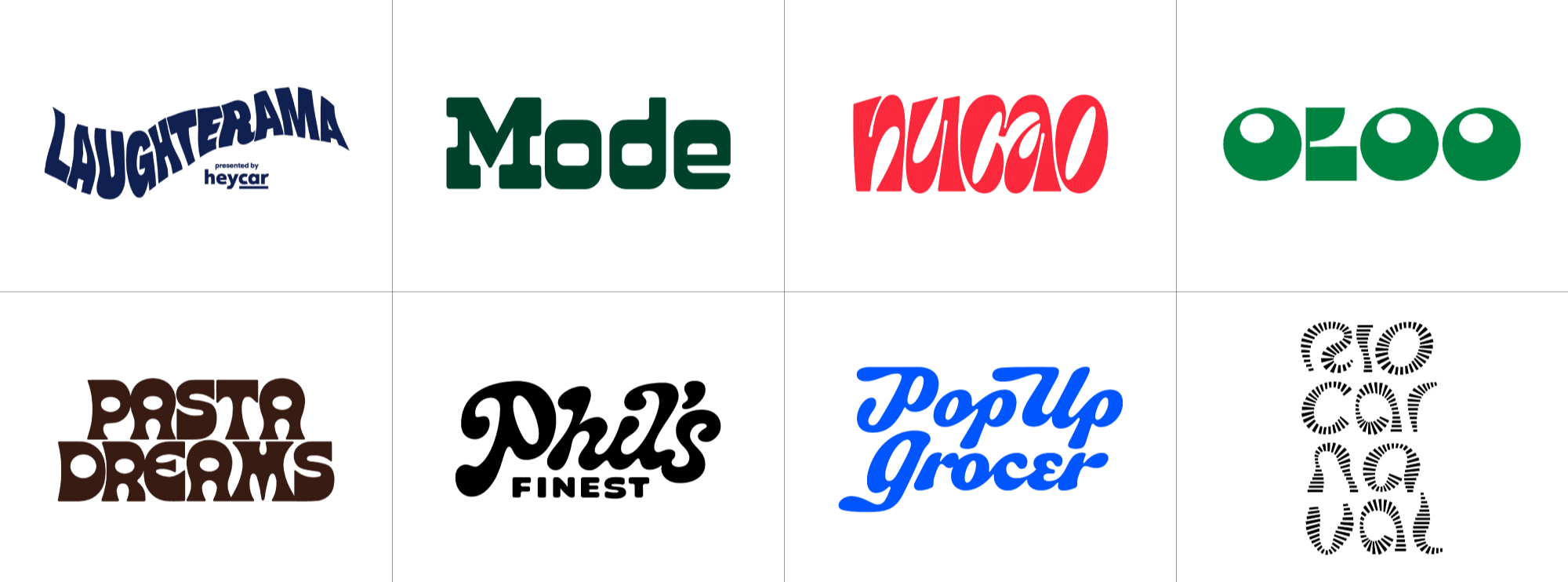
RIO CARNAVAL BY TATIL AND PLAU DESIGN
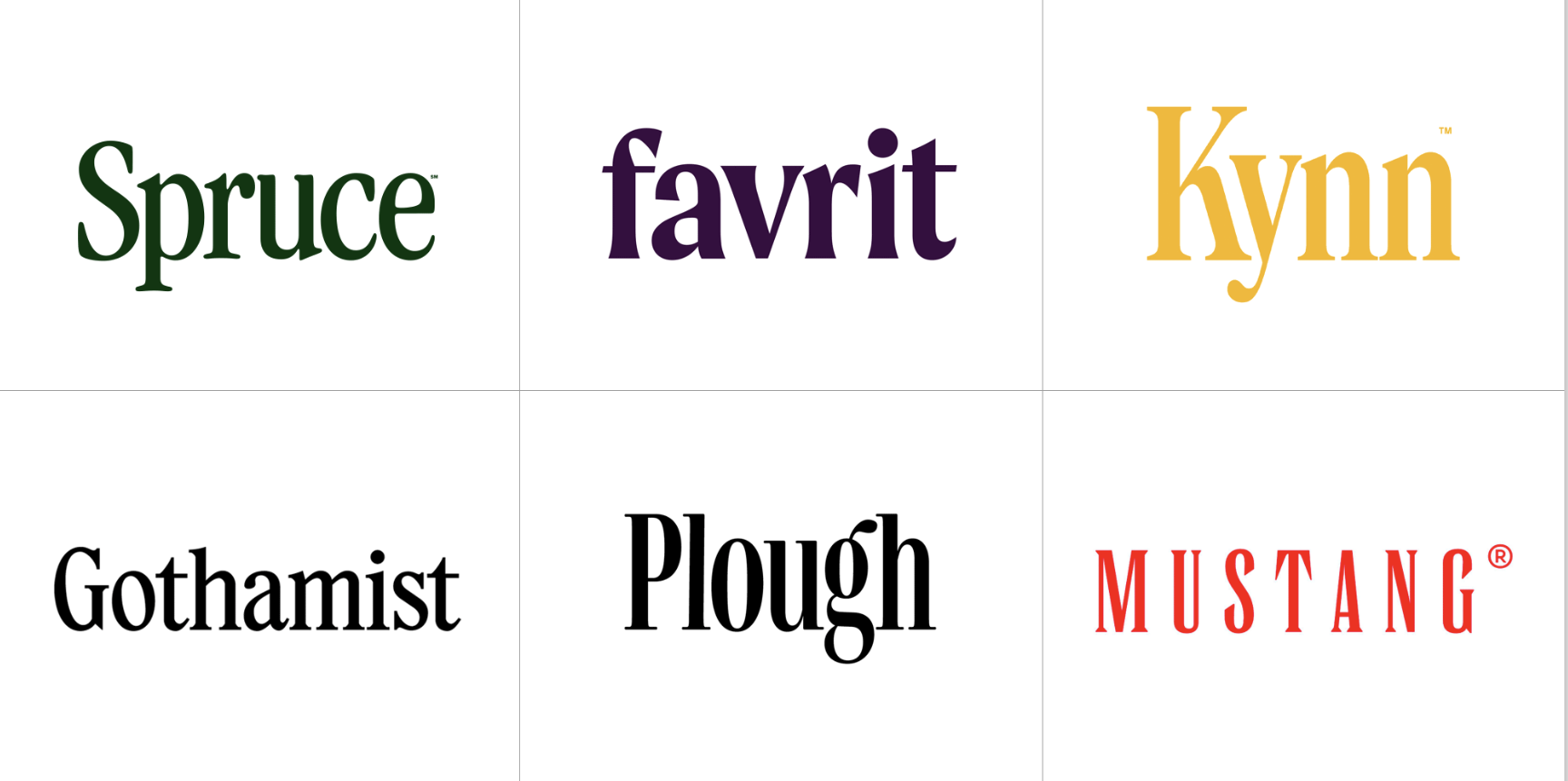
FAVRIT BY SCANDINAVIAN DESIGN GROUP
- Moolongtype - Kiriko: Kiriko takes an unconventional approach to typeface design, prioritising visual appeal over legibility. It incorporates Kanji, Kana, and Latin alphabets, each with a different structure. Kiriko has strong, distinctive characters that harmoniously form a friendly family.
- Moolongtype - きりこ: きりこは、読みやすさよりも見た目の美しさを優先した、書体デザインに型破りなアプローチを取っています。漢字、かな、ラテンアルファベットを取り入れ、それぞれが異なる構造をもっています。キリコは力強く個性的な文字を持ち、それらがハーモニーを描きながら友好的なファミリーを形成しています。
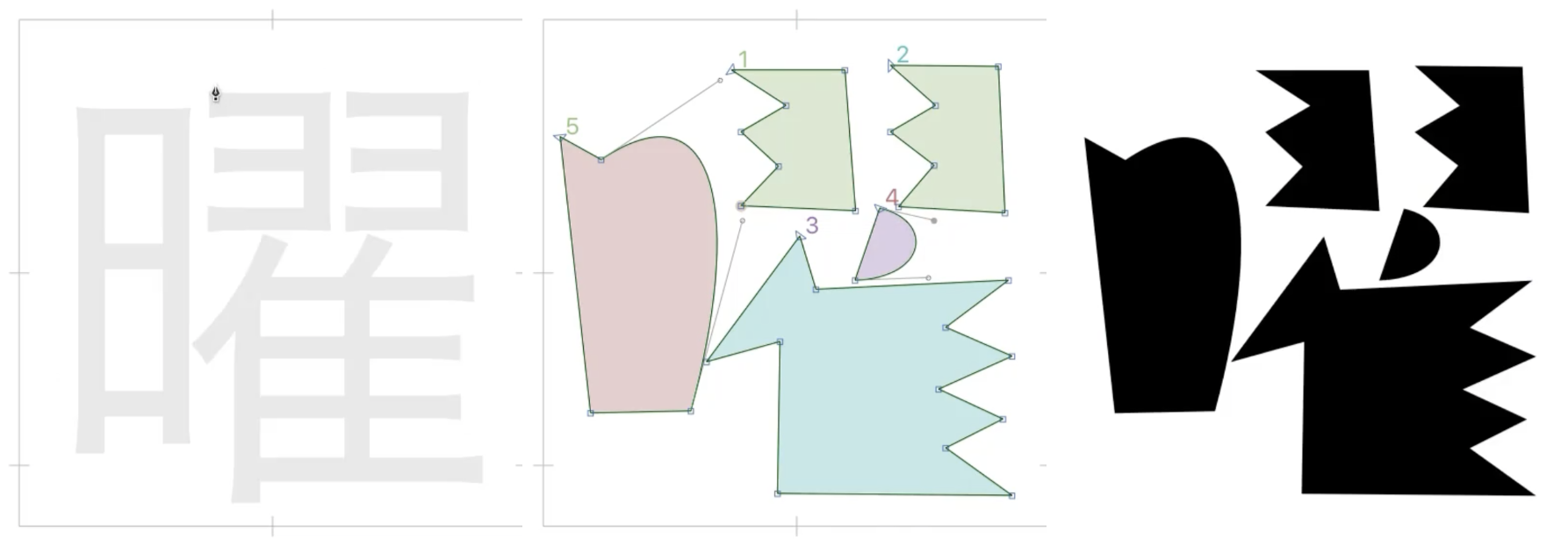
Kiriko – Ayumi Kiryu for Kinuta Font Factory
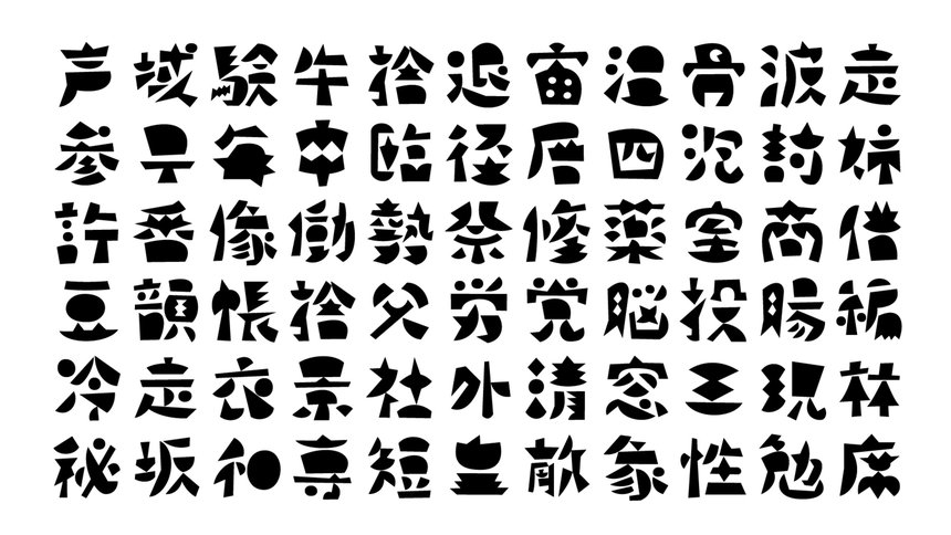
Kiriko – Ayumi Kiryu for Kinuta Font Factory
次回は、インクルーシビティに注目: デザインシステムの再構築: 個性と効率の架け橋についてです!